Python plt 利用subplot 實現(xiàn)在一張畫布同時畫多張圖
arg1: 在垂直方向同時畫幾張圖
arg2: 在水平方向同時畫幾張圖
arg3: 當(dāng)前命令修改的是第幾張圖
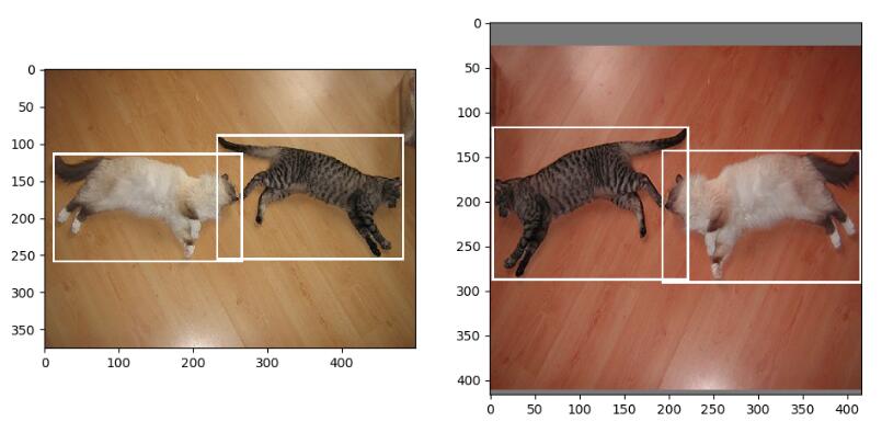
plt.figure()另起一張新的畫布from PIL import Imageimport matplotlib.pyplot as pltimage1 = Image.open(’1.jpg’)image2 = Image.open(’2.jpg’)plt.subplot(121) plt.imshow(image1)plt.subplot(122) plt.imshow(image2)plt.show()
補充:matplotlib 同一個畫布繪制多張圖,主次刻度,豎線
我就廢話不多說了,大家還是直接看代碼吧~
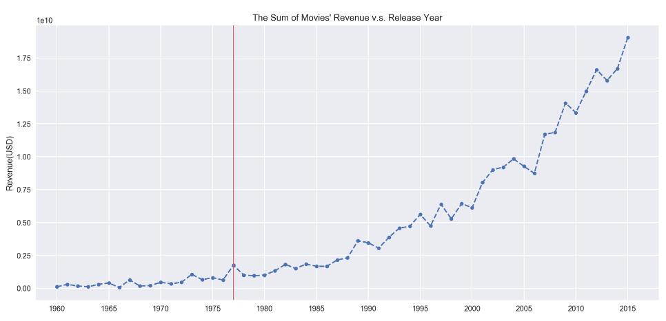
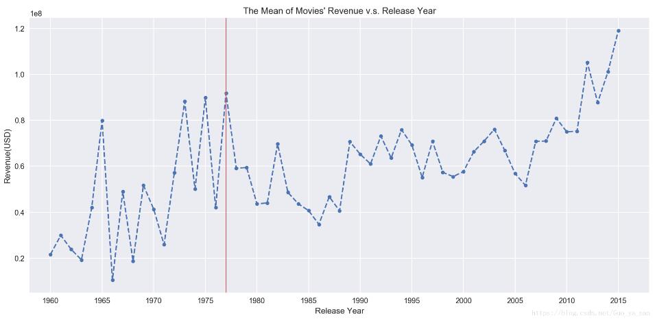
import matplotlib.pyplot as pltimport seaborn as snssns.set()# 要分析的數(shù)據(jù)profit = df_profit.groupby(’release_year’)[’profit’].agg([’mean’,’sum’,’count’])# 在同一個畫布中繪制兩張圖plt.figure(figsize=(15,15))# 圖一:每年上映電影的總收入ax = plt.subplot(211)# 設(shè)置x軸 范圍ax.set_xlim(1958,2018)# 設(shè)置x軸 主刻度,(次刻度設(shè)置minor=True)ax.set_xticks(np.arange(1960,2018,5), minor=False)# 畫圖ax.plot(profit[’sum’], linestyle=’--’, marker=’o’, markersize=5)ax.set_title(’The Sum of Movies’ Revenue v.s. Release Year’)ax.set_ylabel(’Revenue(USD)’)# 增加豎線ax.axvline(x=1977, color=’#d46061’, linewidth=1);# 圖二:每年上映電影的平均收入ax = plt.subplot(212)# 設(shè)置x軸 范圍ax.set_xlim(1958,2018)# 設(shè)置x軸 主刻度ax.set_xticks(np.arange(1960,2018,5))# 畫圖ax.plot(profit[’mean’], linestyle=’--’, marker=’o’, markersize=5);ax.set_title(’The Mean of Movies’ Revenue v.s. Release Year’)ax.set_xlabel(’Release Year’)ax.set_ylabel(’Revenue(USD)’)# 增加豎線ax.axvline(x=1977, color=’#d46061’, linewidth=1);
以上為個人經(jīng)驗,希望能給大家一個參考,也希望大家多多支持好吧啦網(wǎng)。如有錯誤或未考慮完全的地方,望不吝賜教。
相關(guān)文章:
1. 關(guān)于WPF WriteableBitmap類直接操作像素點的問題2. JavaScript前端中的偽類元素before和after使用詳解3. PHP JSAPI調(diào)支付API實現(xiàn)微信支付功能詳解4. asp取整數(shù)mod 有小數(shù)的就自動加15. 源碼分析MinimalApi是如何在Swagger中展示6. ThinkPHP5實現(xiàn)JWT Token認(rèn)證的過程(親測可用)7. ASP基礎(chǔ)入門第一篇(ASP技術(shù)簡介)8. 熊海CMS代碼審計漏洞分析9. 表單中Readonly和Disabled的區(qū)別詳解10. PHP laravel實現(xiàn)基本路由配置詳解

 網(wǎng)公網(wǎng)安備